Tuesday, 10 March 2015

EVALUATION

In what ways does your media product use, develop or challenge forms and conventions of real media products?


Starting with the conventions of the deep house music genre, I did a lot of research into it and found that there was not essentially a stereotypical music video actually created for the genre, and that the conventions of the videos expand widely. However, a few common traits included such things like choreographed dancing within groups and also very romantic themes. Females are also a main focal point in deep house videos displaying their beauty and elegance usually, but also displaying provocative images. Most videos also show close up camera shots of the feet which relate to the idea of dancing, throughout our music video we have a big focus on feet this shows we have met this convention. Lip syncing is something that is often used within these music videos, and we thought that including lip syncing would be a great idea as it reassures the audience to pay attention to the lyrics. This was important for us because the lyrics have a relationship with the video and It is shown through our use of slow paced editing, as the singer is singing slowly, with short breaks, also as the lyrics are sung in first person you can relate them to the main character and think of them as his feelings. Furthermore, it is also very apparent in deep house music videos that there is always a main character which has the most attention. Our video shows the main character going through his day which includes him smoking and meeting up with friends, in this we look to show the character as youthful and representing aspects of the lifestyle matrix which is a [ psychographic model to profile audiences it includes Tribe wired (Happy, outgoing, crazy, creative) and Fun/antics (funny, crazy, creative) individuals these are people that fit into the teenager - young adult category and are people that enjoy life by having fun and being spontaneous. The main character in our video is also wearing very trendy clothes and trainers which fit the description of aspects of the lifestyle matrix, as these types of people are usually very focused on standing out and being trendy. This all relates to the genre we have chosen in terms of the audience that surround the genre, which are typically tribe wired and fun/antics individuals and in this we have looked to appeal to our target audience. Although we have used the forms and conventions of the deep house genre, it is evident we have strayed from this also. The reason we have challenged forms and conventions is the fact that our video actually has a deep meaning to it and is very serious compared to the majority of deep house videos, where partying and females are shown to be a focal point. Alcohol and drugs are substances that are approved by deep house music genre as they are linked to partying and having a wild time, however in our video we have shown alcohol in a negative way as it links to the death of an individual this is challenging the codes and conventions of our chosen genre.


Religion is something that surrounds our video in many ways, whether it is subliminally, metaphorically or even obvious. I feel this is a huge step to challenging the forms and conventions of deep house as religion is not necessarily a popular topic to be shown through music videos. This symbolism is immediately seen in the introduction to our music video where the tracking shots are used to display the scenic view and also the sky where the clouds and sun is visible. It is a recurring theme throughout our video as the sky is shown often and also, at the end the main character is seen looking towards the sky. Another obvious factor which shows religious symbolism being important in our video is when the character finds a cross on the ground as he is walking; this reminds him of a sad time of when his girlfriend passed away, a flashback was used to create this scene. There is a song called 'Prayer in C' by Lily Wood (Robin Schulz Remix) which many people argue over what the lyrics are about but I feel the lyrics of it is a message to god the that also paint a vivid picture of the sufferings in the world. "See the children are starving and their houses are destroyed" is a good description of what's happening around the world. In the video they rebel against the government by vandalizing walls, they rebel against God as to them happiness and pleasure is holy, and vodka shots and homosexuality are their communion which they jealously follow and the idea that carnal pleasure and satisfaction is actually their god. Overall, I feel our music video has more so challenged the general codes and conventions of the deep house genre rather than conforming to them and we have definitely created something unique within the genre, this is believe is clearly shown with the music video due to the excessive religious symbolism and the lack of partying lifestyle which is usually shown. 


How effective is the combination of your main product and ancillary texts?

As a group we decided that we were going to create a digipak and a page of a magazine as the ancillary task. The soul purpose of a digipak is to promote the image of the artist, and define how they are perceived to audiences. It is very important to some artists in the industry to make music as an art form which has meaning rather than to create high commerce with their products. 

Magazine page


                                               Digipak


Furthermore, in the deep house genre a majority of artists do in fact make products that intend to appeal to mainstream audiences to achieve greater sales, so these artists will create album covers which are extremely vibrant and contain appealing images which attract attention, and also with the promotion in magazines. We have not followed this as you can see in the digipak above we have opted for a minimalist approach which is very apparent, this is because we feel the music should be the most important aspect rather than how the artist is portrayed. The digipak does indeed correlate to the music video we have created as it shows the main character used in the music video, and he is looking at views like he is trying to search for meaning, this links to the music video in a way that the main character is seen going through his day walking and walking and there is never a moment where he is not carrying on. Also, linking back to the lifestyle matrix, tribe-wired individuals are happy, outgoing and free-spirited this is our main audience so this can link to the idea that the world is your oyster and its there for you to explore. 

The actual front cover of the digipak includes a picture taken from the behind the main character who is facing towards the sea and he is creating a cross symbol with his body, which relates to the idea of religion which is common symbolism represented with our music video, but instead of using an actual cross we thought using the character and him making a cross shape with his body will have greater significance as it could mean he is looking for god. No specific colour scheme is being used in the digipak it is just the natural landscape that can be seen, this I feel shows purity, which is something that is very consistent with religious themes for example an individual looking to become at one with god will have to start fresh hence be pure. Furthermore, having earthy colours throughout our digipak and magazine combine well with the music video as you can see a lot of brown and green. With the magazine page it was very fundamental to us that, it fit into the theme of minimalism and interlinks with the music video. This idea has certainly been achieved because we have used the main character at the bottom of the page, who is facing the view with his back to the camera once again like he is looking out to find meaning. This is a good effect of synergy as both products include the main character. As you can see we have also opted to use the same font in both the tracklist of the digipak and header of the magazine page, we had to do this to keep the same house style that runs through both tasks and maintain a brand image, that the 'Dolce Vita' font will be used for all of our products so audiences are aware when they see this font it belongs to us. The short quote which is displayed in the middle of the page provides promotion of the album which is being released by the artist, when audiences read this they will be more likely to be influenced as they are more likely to trust the opinion of the artist. We decided that using brown as the colour for the background interlinks with the main task due to the colour of his coat.  To further promote the artist a record label is also provided on the magazine page. With both ancillary tasks it includes the main character of the video and he is also wearing the same clothes in each product and is the main focal point, this idea will allow audiences to construct a relationship with this character before even seeing the music video, which is very important to us because it is a very key factor in the sense that the audience will understand and appreciate the music video to a fuller extent. 


What have you learned from your audience feedback?

To start with talking about the aspects of our product that the audience thought was done well was, the fact that we constructed our video in a certain way which created an emotional relationship with the main character.They felt they were watching his life and was personal. Furthermore, it was stated that the song choice and the music video fit extremely well together as one of the lyrics was '’Keep on riding on, and on keep on riding on’‘ and at this moment in the video the character is seen walking down the street which is shown in 3 different angles. Another scene which the lyrics matched what was happening in the video was when the character is putting his shoes on and the lyrics at this point are '’By the time I put on my shoes’‘. Scenic shots are often used in our music video especially of the sky, many people in the audience really enjoyed this idea because it does give the video a spiritual and religious feel, which is exactly what we aimed for. At first we only had one scene which had lip syncing, but due to some of the audience really liking it we had to make another scene which included lip syncing, which actually made the video much better this was a very substantial piece of feedback. Now onto elements which needed improvement and what we found from a group of 4 individuals was that the location choices were good, however they felt that we should choose more urban environments as the song we chose has an urban vibe to it. This feedback proved extremely useful and actually contributed to us changing some of the ideas of location within our music video.

 The preliminary piece that we made was based on one of the scenes which would be included in our music video, so any feedback provided would be ideal. What the audience mentioned was that more camera shots should be added in order to distract the audience from being bored of the character just walking. This lead to us using tilting shots, close ups and even long shots.  Our group decided that we were going to do a voxpop and show our music video to a small group of individuals within our sixth form, that fit into our target audience. We thought this would be a great idea as public opinions could provide us with information into readjusting the video and making the message more clear.Included in our video a short flashback scene of a girl who died due to drinking too much alcohol. The audience was unsure of why this had significance and why the main character found the cross and the meaning of the cross and why it held significance to the main character.  This in fact provided us with ideal information, as we then altered the video to make it more clear as to why the cross was linked with the girl who died.

 Our last audience feedback involved us displaying our finished piece including the ancillary tasks, to an audience of students within our sixth form college. We had constructed a questionnaire which was to be given out before the viewing of the music video and ancillary tasks. The questionnaire included questions about each product and the audience were to answer them once they had finished viewing the whole piece. From this we gained a lot of useful feedback which we have interpreted in the form of pie charts. Overall we narrowed down the questionnaire to 3 questions and then analysed the results from them, there was a question we chose for each piece we created.

Question 1: What message do you feel we have conveyed with this music video ?

With this question we set out to find out if our audience viewed and understood the music video in the way in which we did, and that the message we chose to convey was clear. 

We outlined the key quotes that we received from this question and these included: 

"Alcohol kills"   "Guided by God"   "Characters journey"   "No matter what stay strong"

Question 2: Does the magazine page encourage you to watch the music video?


An audience of 45 people viewed our magazine and a total of 41 individuals felt that the magazine page did encourage them to watch the music video, where as 4 individuals said that it did not encourage them. One reason why the audience said no to the question was possibly due to the fact that during the display of the magazine page which was done as a projection, the top of the magazine page was actually cut off due to technical difficulties this meant only 80% of the magazine was viewable.

Question 3: Does our Digipak look professional ? 


This was a question that needed to be asked as our group were very skeptical on whether the digipak looked like a high calibre piece of work. Also the idea that we went for a minimalist design could of backfired and lead to the digipak being extremely bland and unprofessional, hence why we wanted to find out if this was the case. However, a total of 45 people answered this question and only 3 students thought that the digipak lacked professionalism. Overall, we feel extremely happy with the feedback as it clearly shows that our use of synergy across the 3 products was done very well, when audiences viewed the digipak they may have thought back to the magazine page and music video leading to a positive answers for the digipak. 


How did you use media technologies in the construction, research, planning and evaluation stages?


To film our music video we used a Sony HDR-FX1000 this was used by every member in our group including me, to film certain scenes. As the process went on we all improved our skills in using the camera which contributed to producing a professional final piece. This camera allowed us to film very high quality clips which then would be imported onto iMovie so that I could edit them.


 Blogger is a website in which I used to post all my research and planning which lead to the creation of the main product. It is a free online blogging platform and was extremely useful in allowing me to note down all the research I carried out on the chosen genre which was Deep House. In this I carried out research on the genre, codes and conventions and reasons why we as a group chose our idea. Reasons it was useful was due to the fact we could edit any of the posts at any time if we found out new information, or if we changed any of the ideas for the music video. Not only is it useful for me to post new ideas and blog about explaining the reasoning behind the chosen idea, but it also is useful for teachers. This is because teachers can view the work and thus provide their own feedback on what to improve in order to achieve the highest grade possible. I feel that the use of this platform has definitely contributed to organising and constructing valid research and planning to make the best product possible.


An absolutely vital website for us was Youtube, this is because we could carry out research and analyse other videos made for the deep house genre in order to stand out and make something unique, rather than fitting with the common forms and conventions which we did not want to do. However, a lot of influence came from Youtube also as we were able to understand the types of editing and camera work that can be experimented whilst filming a music video and we definitely developed on some of the ideas for example keeping the same pace of editing with the song and different angles in which we could film from. In our group we each had a delegated role. Gur was in charge of creating a magazine page in which he used Photoshop in order to do so, this software led to him creating a very impressive product which includes promotion of the artist and the digipak. Photoshop was again used by Chantelle, as she was in charge of creating the digipak. A Canon DSLR was used to construct the digipak as it was required of Chantelle to take pictures of the main character who was going to be present on the Digipak.


This helped us to gain good quality images. The Digipak is another great product that truly establishes a relationship between both ancillary tasks as they both include natural and minimalist designs with the main character of the music video present on both products. I was responsible for the editing of the music video, and to do this I used iMovie. This required me to make sure the song was in sync with the clips and to make sure the editing was at a perfect speed. Also, I had to make sure that the footage didn't seem boring and included effects which were not over done and looked professional. Furthermore, it was also important that there was still a minimalist effect to the video. One target for me was to create a music video that stood out over music videos created by other students. I feel I successfully achieved this target, allowing for the product to be extremely unique and creative.


Tuesday, 3 February 2015

DIGIPAK RESEARCH

Digipak analysis

Kanye West - MBDTF


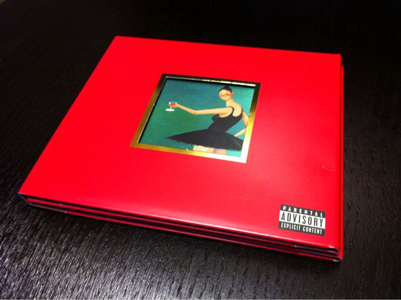
This is the digipak for Kanye West's album 'MY BEAUTIFUL DARK TWISTED FANTASY' as you can see it is very minimalist, however it uses a strong red colour and a painted picture which is done by George Condo, who actually painted 5 alternative pictures for the album. In this version it shows a picture of a ballerina who evidently has a moustache and is holding a wine glass. This picture shows the ballerina toasting, and the full meaning of this cover relates to one of the songs on the album called 'Runaway' the video for this track includes many ballerinas. One of the lyrics from the song is 'Let's toast to the scumbags' which links with the picture as the ballerina is toasting with the wine glass. 


This is what is included inside the digipak, it is Kanye Wests's name which is created along the four panels using different objects and in a gold colour, this is extremely arty and high class which could link to Kanye Wests interests and personality. I feel it does do this as Kanye West is certainly an aesthete and looks up to fashion and art.


A deluxe edition of the album digipak was also released which included three 12 inch records, this is something that isnt done regularly by artists, so you can see that Kanye West went through extreme effort to create something which fans of his music would be happy with. Kanye has feature 5 different posters which can be slotted in the front of the album cover they all relate to different music videos created within the song also. This also allows for fans to customise the album. The use of red is very emphasised throughout the digipak which connotes strength and power a very recurring theme within the digipak.


The XX - Coexist


This is the digipak for an album created by The XX who are an indie music group who create electronic and minimalist music, as you can see it is a very simple digipak as you fold the cover when the booklet is removed the 'X' is revealed, the 'X' happens to be the main focal point which is a consistent theme for The XX as it is also included on their old albums.However it is very unique but basic which overall reflects the bands vibe as they make unique music which is very simple and creative. There are no images of the group on the digipak which I feel could be to do with the type of music they create which is indie, most indie artists want to remain as unseen as possible and let the beautiful music paint a picture. Furthermore, The XX are signed to XL recording which itself are an independent record label allowing artists to create how they want to create and are not advised on how to promote their image, this can be another factor as to why the group may have not included their image.


The colour used for the digipak are very simple colours black and white however the iridescent oil spill is also included inside. This idea could actually relate to the name of the album 'Coexist' which means to exist at the same time in the same place. The simple colours can tell you a lot about the term 'Coexist' as black and white is a colour used in Yin and Yang which links to coexisting, then you have the iridescent oil spill inside also so this could represent complexity, where as white and black is simple. Furthermore, this also represents society aswell because everyone is different.


The Weeknd - TRILOGY


This is the cover for The Weeknd's album 'TRILOGY' the main focus is the artist himself looking away from the camera perhaps at the string of a balloon. He is also looking at the balloon string with regret. The balloon is a recurring theme with the artist The Weeknd, as it is included in some of his artwork and one of his songs is called 'House of Balloons' in this picture in the Mise en scene, I think the balloon represents a party and The Weeknd's body language suggests he is in regret also he is looking at it with regret as he may have done something he wish he didn't do, this links with the female hugging him from behind meaning he regrets being with her. Black is really emphasised on the cover this represents the darkness of the music on the album, the picture is also in black and white which coincides with the album being dark, so the design of the digipak definitely reflects the style of the music and the artist himself. The use of low key lighting in the photo also has a relationship with the type of music The Weeknd creates, which is very often sexual. The use of Mise en scene definitely depicts a sexual atmosphere which is very often seen in the genre of music he creates.


There are 3 CDs included within the digipak all of which is a seperate collection of songs and all have a different name made by The Weeknd, which form the trilogy.Each CD has a different booklet to go with it which fit the theme of each CD. The booklets all slot into the compartments under the CD and you are able to fold the digipak together.This function allows for the consumer to easily navigate through the digipak and navigate their way through it clearly with direction and understanding of the music and artist.


alt-J - An Awesome Wave


This is the digipak for alt-J's album An Awesome Wave, the image on the front is actually a zoomed in image of the ganges river delta, this also links with the name of the band alt-J which when you type onto a keyboard makes a delta sign.There is a lack of any text on the cover art which is quite a recurring theme for indie artists as they may feel the music should be the most important thing and fans should focus on that rather than the image of the artists, also its a very distinctive album art so fans will definitely recognise it in the stores. As you can see there is a delta sign on the inner of the digipak once it is open, this reflects the band once again as delta is essentially the idea of the band name. The CD slots inside the compartment and it also provides a 3D effect which displays extra creativity on the design on the product.


XXYYXX - Self titled.


This is the cover for XXYYX self titled album, it is a CD cover rather than a digipak but I wanted to use this as research because what you can see is very interesting. The Triangle with the eye (all seeing eye) in the middle is a very controversial image that is used to relate to the 'Illuminati' this is a conspiracy theory that many people have used to talk about in the music industry and certain artists are said to actually belong to the 'Illuminati'. It is said they create music that is often not created by themselves, but by another source which enforce artists to create music in a certain way. The main focal point is this image of the triangle with the eye, however it is shown with a tear drop pouring out of the eye. I feel that the artist is kind of aware of the conspiracy surrounding it and is poking fun at the idea by using a tear drop pouring out, which could mean the content of the artists music is not pleasing to the 'Illuminati' as it is very underground and not mainstream music. The artist has clearly shown their name in bold and in very big writing to perhaps state that their presence is quite important, it is also very easy to take in and a minimalist design, the use of very simple pastel colours supports the minimalism. Furthermore, going back to the idea that the music is more important then flashy album artwork. This idea is very important to our group,and that we should create something of importance and significant meaning, rather than appealing to the mass audience in the mainstream we opt for a niche audience who understand conscious music.


Friday, 30 January 2015

PRELIMINARY PIECE AND FEEDBACK

PRELIMINARY PIECE AND FEEDBACK

This is our preliminary piece for our music video, we created it for a trial and error situation to show to our audiences and ask for them to provide us with useful feedback into whether it is necessary to use and what we could improve and how.


Audience feedback of Preliminary piece

As a Group we asked a number of students within our what they thought about our Prelimary piece as a whole, we sat them down and provided headphones for them to watch the short video on a computer screen. Here are some of the comments made by the individuals who viewed it:

Michael
'' Nice video, and the song syncs in quite well with the whole idea of the video,but I dont get the cigarette being dropped at the end''

Jordan

'' Very good video, but I think the editing can be improved a bit but good job''

Enayath

'' Quite simple,  but it does fit well with the music''

George

'' It was good but it is very simple, although I do feel it fits well with the music, you should add more camera shots''

Sanjay

'' I did not really like the song but the video was good and love the concept of zooming into the cigarette at the end''

Roz

'' I really love the idea of the video and the song, but the camera work could be better''

From this feedback we have gathered as a group that we definitely need to improve the camera work and include more camera shots into our video. We will take this on board whilst creating our real music video in order to create the best product we can possibly make.

Thursday, 4 December 2014

PRELIMINARY PLANNING

PRELIMINARY PLAN


This is our preliminary storyboard, in which we will use one of the scenes from our music video to film. We have chose a scene in which grasps the nature of our idea and displays the character used in our video as much it can be, this will lead to us getting more useful feedback as there is a lot of content to analyse.